Monday 29 September 2014

Image Bank - Tone

Here are some images from the web that all have different tonal values to them. The main tone used is black and white but often photographers will change the image to an orange colour which also works well wight the image and makes it look older then it actually is. Tone can make an image very interesting because in some cases by removing the detail of colour you actually get more detail in the image which is rather interesting. Another thing with tone is it can be used to make the viewer focus on a specific section of the image.


In this image I like that the blacks have been turned right up which cause the boats in the background into just fully black boats with no detail to them. It makes the viewer look at the bridge and the lake in more detail which is the main focus in the image.  I also like how there is a black border round the edge of the image because it makes it rather interesting and adds to the dark in the image.

Here we see an interesting  picture of tone that contains some mist and has a very gloomy feel to it and the photographer has managed to capture that feeling into the image above. In this image it also looks rather gloomy and horrific. Tone can also make an image turn from a normal basic image into a horror image.

In this image here there is less tone used it is only slightly but it still works very well with the image. This is because it added an orange tone to the image because of the sunset and makes the whole image rather interesting. We also see that it has added to the vibrance of the image.

Here we see a black and white tone which has made all of the people look like a shadow and works well with the clouds which now look like storm about to hit the mainland. In this image it looks like the backs of all the people have been turned right up to make them look like a shadow on the beach.

Here we see the photographer has taken a picture in the middle of the road and it looks like it was taken early night. The photographer has edited the photograph so that the tone is orange which I think works well. This makes the image look like a really old image because back when cameras where first made the image produced would sometimes turnout with a very strong orange tint.

The thing I like about this image is that it looks a bit creepy and looks like the start to 'Silent Hill'. I also like how the mist covers all the background and makes it look hidden. This adds a level of mystery to the image itself. I also like how because of the mist and the tone of the image we can only see what is along the road and nothing else.

Straight Images-Tone


Sunday 28 September 2014

Research On Ansel Adams

Ansel Adams:

The thing I like about Ansel Adams is his unique ability to inject so much drama in his images.  He does wait for the best sky's and the right time of day to get the shadows right but every photo has dark and light areas but his images take this to a new level. What I find inspiring about his works is he always manages to get such a range of tones that appear to be unachievable by other photographers. His black and white landscapes are just amazing.


The thing I really like about this photo is it looks like the mountain is being eaten by the cloud. It looks like a bomb blast. I also like the contrast between the movement of the sky and the stillness of the mountain.
In this photo I like how the shadow of a cloud is making its way across the canyon and there are only a few areas that still have light reaching them.
In this photo I like how the lake looks like mercury and the mountain look like they are shrouded in mist.
In this photo I like how the sky looks like a stormy sea above the mountain and how the contrast of black and white make the mountain  look bigger then it is.
Ansel Adams is very good at using tone to show the detail. This goes against what the viewer would think because we would think that you can't have much detail without colour but somehow proves us wrong because he mange to show the detail of the landscapes in his photos.

This photographer has influenced me in to trying to get as much detail as possible without using colour. I have tried this with lots of my photos to see if they work and have posted what I think are the best photos. He is also very good at getting the overall feel of the image and how you would feel if you were there.I have used this in my work by making an image of a landscape into black and white and showing more detail that can only be found in black and white like Ansel Adams images.

This photographer is very good at managing to capture the raw strutter and layout of a natural beauty and still some how does that even though most of his work except for when he experimented with colour is in black and white.

Research On Robert Capa

Robert Capa:

The reason I have chosen Robert Capa as one of my photographers is because he manages to capture peoples emotion and movement in all of his photos which I think is a very good skill. I find he work to be very appealing to me because he has lots of war photos and I think that he has represented the people in those photo as good hardworking people who are trying to end a war, he also manages to capture peoples emotion of being there and what the future may hold.


Here we can see some Asian children having a snowball fight and we can also see that Robert Capa has managed to capture their happiness in the photo even though there is a war going. This image shows that even if there is a war the children can escape from the horror and enjoy themselves.
In this photo we see a wounded solider being bandaged up after an incident.  The thing to think about with this photo is that after that he probably had to go straight back to where he got that injury and had to face the horror of war again.
In this image we can see how grateful the people were to the soldiers because here we have a french farming offering cider to American soldiers about to fight in another battlefield to liberate some more of that persons home country.
In this image we can see the horror of the storm at Normandy and we can see some of the people who were shot down still floating next to their living friends. This image just shows  the horror of storming the beaches.
Robert Capa is an excellent example of movement and tone in photos. Robert takes a still image of people in movement without blur and also uses a black and white tone. His use of tone adds to the affect of the movement in his images. The photos he takes are still image but you can tell where and what type of movement everyone in the image would have made directly after the photo was taken.

This photographer has influenced me to try to get photos of some types of atrocity and find photos of people in the middle of it trying to make a difference. This is because in lots of his photos he takes he takes photos of the bad for example people dying in WWII but also takes photos of people with nothing giving stuff to solders who are fighting for them to have freedom. In my work influenced by Robert Capa I have included images that show people wanting freedom and signs of freedom.

To summarise this photographer is good at managing to capture movement in the photo and his photos are good at telling the story that happened before the photo was taken and what happened after it was taken. I think that this is a very good trait in a photo because it makes the viewer more interested in the photo.

Research Log


Robert Capa:

http://www.magnumphotos.com/C.aspx?VP3=CMS3&VF=MAGO31_10_VForm&ERID=24KL535353

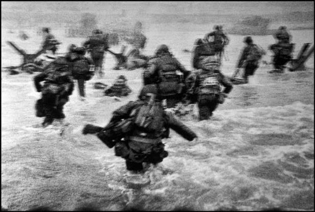
Here is an image of the first wave of American WWII soilders storming the beaches at Normandy, France. This image captures the movement of the soilders as they run head first into the German ground forces. 

Robert Capas was a Hungarian war photographer who took lots of his war photos in WWII but also in some Asian conflicts after the war. The image above is just one of Robert Capas work, he mainly took photos of the war sometimes on the battlefield and also when people were happy that they had eliminated the German threat in French towns. In Capas long history of photography he was killed in when he stepped on a landline and was killed upon arrival at the medical camp. The tone of the image is black and white. Robert in the image above managed to capture the movement of the solders which I would like to try in my own work and try to capture the fast paced movement of people or objects.


Hexlord:


I like that in this photo he has a single source of light that only just highlight his two models and gives them a shadow like effect. I also like that he didn't just use a white light but instead used a red light source to make the image look more sinister. 

Hexlord is a Malaysian cosplay photographer who does lots of work with models in darkened places. He also does lots of work with a type of cosplay called vociloid cosplay. He is well know in the cosplay world for his cosplay photos and also his editing of his photos. He mainly uses colour to show off his photos. Most of his photos contain some form of colour which makes the image what it is. The colour he uses adds to the atmosphere of the image and without it there would be no atmosphere to the images. I would like to try this with some of my work by adding in lots of colour that if they were removed than the atmosphere of the image would be lost.


Henri Cartier-Bresson:


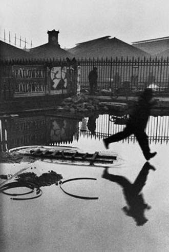
In this image we can see that Henri Cartier has managed to capture a person in mid movement and in mid air. This makes the image look like the person is floting and he also had the persons reflection in the water bellow him as well.

Henri Cartier-Bresson does lot of types of photography, his main two types are movement and people in different emotional and physical positions. He does lots of photos of people doing a multitude of things and he also has images from the start of life to the end of peoples life, and everything in-between.   I would like to incorporate both of his types of photography into my work because I think it would make some rather interesting images. 
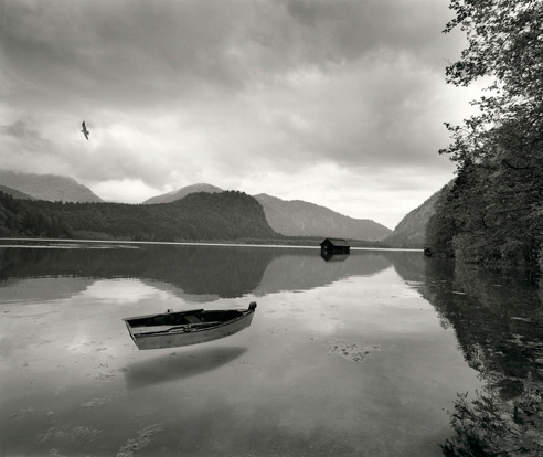


Ansel Adams:


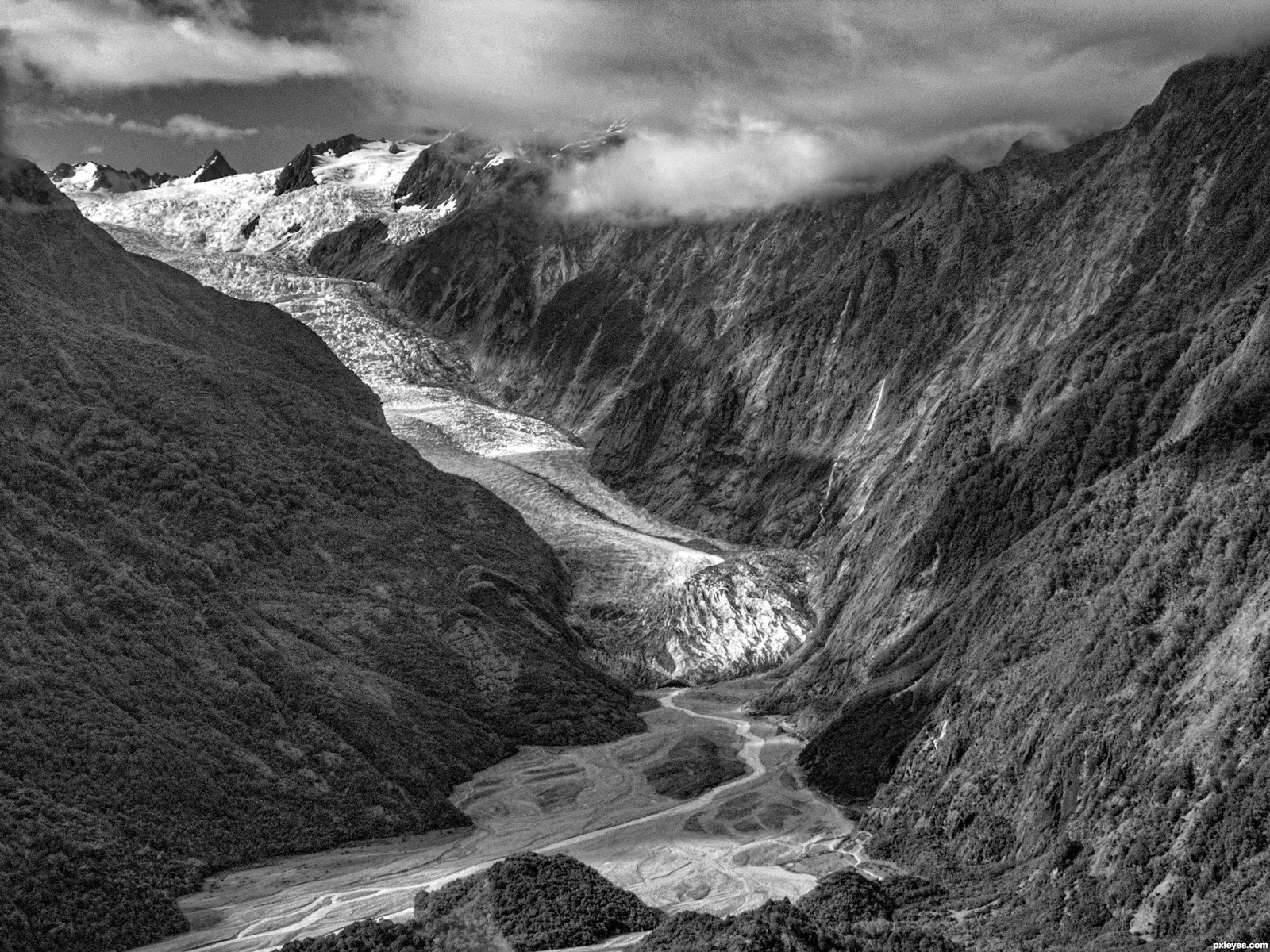
Here is an image of one of Ansel Adams many pieces of a valley in the USA.


Ansel Adams is an American nature photographer who took lot of photos of natural Valleys with rivers and snow. He also most always does his images in black and white tones, but he did experiment with colour during his career. I think that the lack of colour in his images and the black and white tone adds dramatically to the image themselves this is because when you look at them you just notice the beauty of the landscape and less the colour of the area which I think adds to the atmosphere of the photo. By doing this it keeps the image in an internal state of mystery.


Larry Burrows:


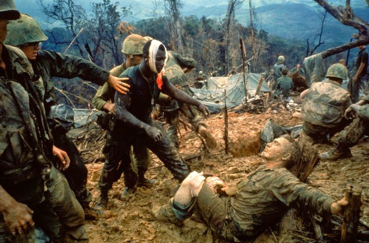
Here is the image known as reaching out, it shows a Sgt going to the aid of a stricken comrade after a fierce firefight.

The thing I like about Larry Burrow is that he mange to capture the emotion of what was happening on the battlefield at the time he has taken the photo. The photo above is like many of his other photo it is of him managing to capture the emotion felt during the time of the photo.


Eddie Adams: 


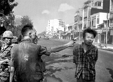
This image shows just before the execution of a Vietnams civilian by a police officer. 

This think that I like about Eddie Adamsn is that with this image it is a group of three images where he took a shot as the prisoner was being moved, before he was shot, and then an image of him dad on the ground as the general puts his gun away.


Tim Page:


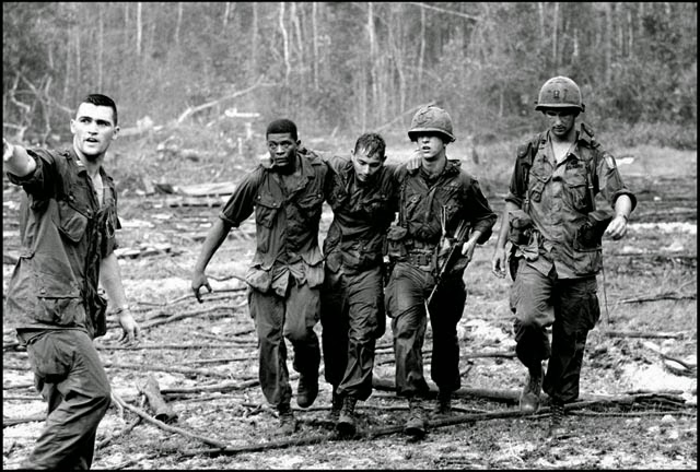
In this image we can see that Tim Page has managed to take a photo of some men retuning back while helping a fellow solider back.


The thing I like about Tim Page is that he gets a wide range of photos, he doesn't just get photos of how the war effected soldiers he also got images of the people it effected as well. He has lots of photos of children helping to re-build and lots of photos of people who were affected by the war. 


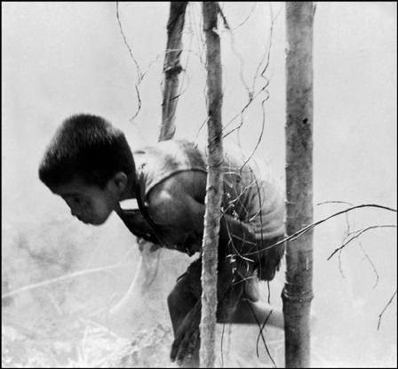
As we can see in this photo it is a little boy running away from a war zone to save his life.


The thing i like about W. Eugene Smith is in all of his WWII photos he doesn't try to sugar coat what was happening he showed people what was happening down in the depths of the war and also managed to capture peoples emotion at that time.


Diane Arbus:

http://www.artnet.com/artists/diane-arbus/

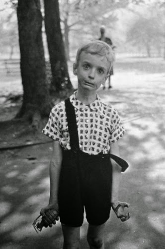
In this image done by Diane Arbus there is a child in the middle of centro park with a toy hand grenade looking a bit crazy.

The thing I like about Diane Arbus is she was not afraid to get pictures that go against the norm and she would also get picture that show people inner self. I'm not say this child is crazy but it shows that there could be a child out there how would really want to throw a hand grenade into a public area.


Robert Frank:

http://www.atgetphotography.com/The-Photographers/Robert-Frank.html

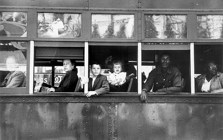
In this photo done by Robert Frank we can see the segregation between black and white people on a bus.
Robert Frank was a great photographer whose seminal 1958 book The Americans broke new ground in documentary photography technique and was widely influential on succeeding generations.

Andreas Gursky:

http://www.artnet.com/artists/andreas-gursky/

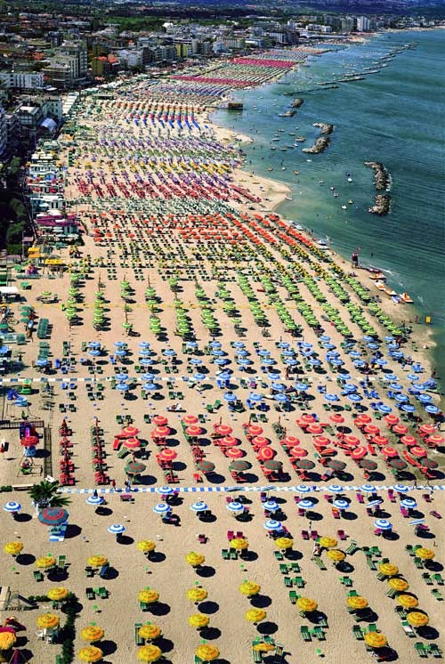
Here we see one of Andreas work were he has taken a photo of a beach with each sections own coloured umbrellas. 
Andreas Gursky is a German photographer who takes pictures of mainly landscapes and also man-made unlikely landscapes. He does all his work in colour and also holds the record for the most expensive photograph ever taken which was sold for $4.3 million.


Annie Leibovitz:


Here we see one of Annie's new work of old fashion clothing and a girl trapped in a dark cave.

Annie Leibovitz is a portrait photographer. She has had the opportunity to take pictures of Queen Elizabeth the II, Mick Jagger, and the rolling stones. She mainly takes photos like the one above of people in old tudor victorian clothing and has them doing things tat would happen during those times like a ball or a dinner party.

Jerry Uelsmann:


As you can see Jerry Uelsmann takes some very strange photos but does them in a black and white tone. 
Jerry Uelsmann only takes black and white tone pictures but he does some creative editing with them like in the one above where the boat is floating and the cabin is resting on the top of the lake as if it was on solid round.

Brassai:

http://www.artnet.com/artists/brassaï/

le fille de joie au billard russe by brassaï
Here we see an image of a model posing doing something normal.
Brassai uses shadow and light, the play between the two is evident in the work of Brassai. He captured the mystique that is paris and compiled that work in his book. Brassai would also take photos of random carving in walls that children had taken to show how they feel in there culture.

Edward Curtis:

http://www.edwardscurtis.com

Here is one Edwards Curtis most well know photos of an Indian Chief.
Edward Curtis just like any other photographer will use the environment around him and its surrounding people to make a great photo. Curtis did this with the American west and the Native American people, as he captured their images.

Berenice Abbott:

http://www.commercegraphics.com/ba.html

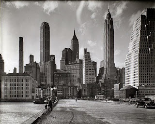
Here we se some photography that has been done that shows the skyline of New York.

Berenice Abbott takes pictures of urban New York architecture in black and white Berenice Abbott took advantage of the subjects surrounding her, the urban architecture of New York City. She extensively uses black and white format that allowed to help highlight some details that gave character to the city.

Alfred Eisenstaedt: 


Albert Einstein, Princeton (© Alfred Eisenstaedt)
Here we see that Alfred has taken a black and white photo of Albert Einstein. 
Alfred Eisenstaedt is most well know for taking pictures of celebrities and he is also very well known because of all of his photographs related to WW II. He worked as a photographer in Nazi Germany and was also jewish at the time then moved to the USA where he then started taking photos of celebrities.

Margaret Bourke-White: 


A DC4 Flying Over New York City (?Time Inc.)

Margaret Bourke-White is famous for her work in combat zones and pictures of Soviet Union. One of her more famous documentary photographs is being one of the first photographers that was a non-soviet photographer to take a photo of Soviet Russia. She was also the first female allowed in a combat area.

Yousuf Karsh:

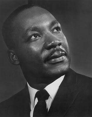
Here is one of his photos of Martin Luther King.
Yousuf Karsh is famous for taking photographs of famous people. He has taken lots of portrait photos of almost every famous person during their main era of being famous.

Paul Strand:

http://www.atgetphotography.com/The-Photographers/Paul-Strand.html


Paul Strand
Here is a very old picture of some people in front of a very odd building.
Paul Strand is an American photographer who along with the help of other photographers managed to make photography an official art form in the 20th century. He also takes photos of all types of genes in photography and has taken photos in multiple continents and has taken photos of everything in his photography life span over 6 decades. 

Wednesday 24 September 2014

Print Technique - Duotone


Print Technique - Black and White


Print Technique - Repetition


Discussion - Formal Element


Discussion:


The formal element are Line, Shape, Form, Movement, Tone, Colour, Pattern, Depth, Texture, and Reflection. These 10 techniques are the elements that make a good photo. If all of the formal elements are used then that means that the photographer has understood the importance of each of the techniques and has incorporated
them into their photo. Without these elements the photo would look plain and dull, and the point the photographer is trying to get across will not because if the photographer is trying to show colour and doesn't take in to count any of the other techniques than that means the photo will not show the colour like the photographer has seen it and will not get his point across about the colour in the photo. The
elements can be used to show a multitude of things within
a photograph.
Lines:
Lines is one of the 10 techniques that a photographer must use.
It is also one of the most important as well because it gives
deffiniton to shapes and objects in the photograph. Lines do
no need to be straight they can be curved, jagged or anyway.
Straight lines give the image definition and also give the image
a structure. Curved lines normally show soft and relaxing settings,
and jagged lines show danger and chaos. 
photograph design theory
Shapes:
The next fundamental element is shape,shape is important within 
a photo because if something didn't have any shape the image 
would be just one big bowl of stuff. Shape ca either be subtle in an 
image or can be bold in an image. For a photographer to be successful in
using shape he must be able to use both of these techniques. 


Form:
I think that form is the most important aspect of photography because
without the ability to use form we would not be able to create the effect 
the image in the photo looking 3D on a 2D image. Form is when you 
use the shadow mainly to make the3D object look 3D on the 2D image.
Pattern:
Pattern in an image can make it look great, but you need to make sure you 
don't just keep an eye on the physical pattern in front of you, you must also keep an 
eye on the light patterns another patterns that affect the image.
Texture:
Texture is needed in all images because without the right 
texture the image would look ruined and would also not 
have the same affect as an image that did contain texture.


photograph design theory
Colour:
Colour is important in an image because without colour there would 
be no image and with little colour the image wouldn't stand out. When 
using lots of bright colour in an image it is important to use lots of light as 
well because this defines the image. When using dark colourist is important 
to use shadows to express the images value.

Movement:
Movement can be captured on a photo by leaving the exposure on 
for longer. this normally creates a blurred image which is why it is 
always best to have a stationary object as the focus.
Tone:
Tone is important to use because it can make a photo look modern
or old fashioned. This is normally added in photoshop or some other 
program used to edit a photo.

Depth:
Depth is not needed in every photo but can be used in photos to
make it look like the image is getting bigger but the line of focus is 
reaching a point. This creates the effect of the outer image getting 
bigger and the focus of the image eating smaller in ratio.
Reflection:
Reflection is not needed for every photo but in some cases 
the use of a reflective surface is good because it means 
you get a double world looking photo. This technique doesn't 
work with every type of photo, it only works with some.


Conclusion:

My conclusion from this is that all photos should contain at least two of the Formal Elements to make it a successful image, if it doesn't contain any of the Formal Elements then that means it is just a blank image and not a very good photograph.